Creating the right logo is an ‘absolute’ when it comes to a company’s branding and identity.
Luckily, logo design inspirations can be seen everywhere. The design of your logo should be able to capture the essence of your brand. That’s because it entices your consumers to purchase your product or service. To help you find the best style that works for your business, we listed down Yeti-approved logo design inspirations. So push your creativity to the next level!
Logo Design Inspirations for Professional Businesses
a.) Google

What makes Google’s logo iconic is that it’s friendly, adaptable, and memorable. Let us break it down for you:
1. Logotype
Logo design inspirations can come from combining geometric forms with schoolbook letter printing. This is why Google’s logo design is playful and simple.
2. Color
Ruth Kedar, the creator of the Google logo, said that they ended up choosing primary colors for the letters G, O, and E. The reason being that it’s easily recognized by the public. They used a secondary color on the letter L just to show everyone that Google doesn’t follow the rules.
3. Typography
The graphic designers used a personalized geometric sans-serif typeface. Their logo has a lot of engineering to set them apart from the rest.
Some may argue that Google’s logo is geometrically flawed, but it’s actually explained by graphic designer Will Patterson. According to the designer, he and his colleagues were thinking about the visual weight of the logo. For instance, they wanted all the colors to have the same perceived visual weight. That’s why they made the yellow arc slightly smaller than the rest.
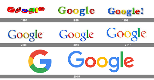
After all these years, Google has never stopped improving its brand identity through its logo designs. Google’s main page has doodles or cartoon characters. All of which are in line with specific seasons like birthdays, holidays, and acknowledgment of artists. They also include other particular influencers to make their design more appealing to the public.
b.) Amazon
,

The first logo Amazon came up with was released in 1995. It has a blue water-like background with the letter “A” that has what looks like a river inside. There is also a caption below that says “Earth’s biggest bookstore.”
Since the first version was developed when the digital era was just starting, their logo had poor quality. It also lacked a personal connection to their audience. Their logo has then gone through a lot of changes throughout the years.
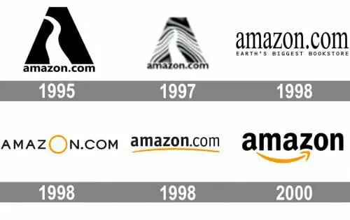
In 2012, they dropped all the unnecessary elements of the logo and went for a simpler look. The new design speaks well for their brand. Mostly since the arrow from “A” to “Z” means that they sell almost everything—from movies, music, groceries, and clothes. The arrow also represents the smiles on their customers’ faces who are happy with their services.
c.) Target

Target’s iconic red and white color represents their brand’s destination and achievements. In business, the circular pattern conveys positive emotions that mean unity, community, and protection. All of which best represent their brand.
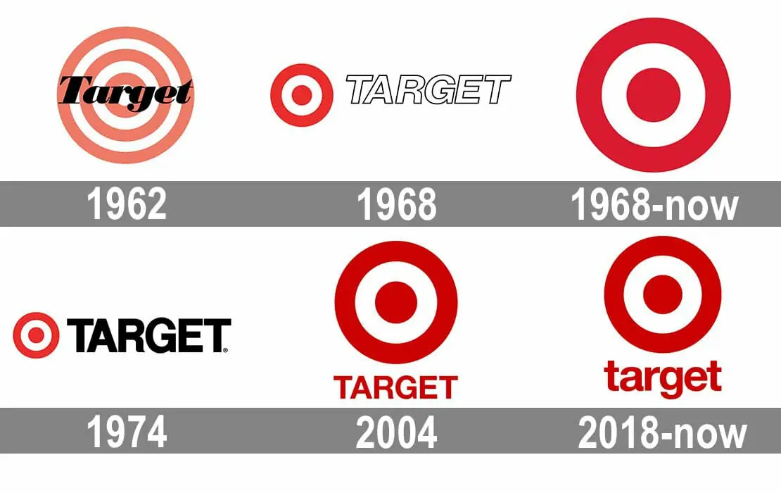
In 1962, TARGET’s PR team went over 200 possible names for the store. In the end, they finally agreed to call it “TARGET.” The first logo design they thought of is, you guessed it, a red and white bull’s eye! The company’s logo ended up looking minimalistic, vibrant, and symmetrical. Plus, their typeface helped their brand become one of the most detectable symbols in US retail today.

f.) Apple
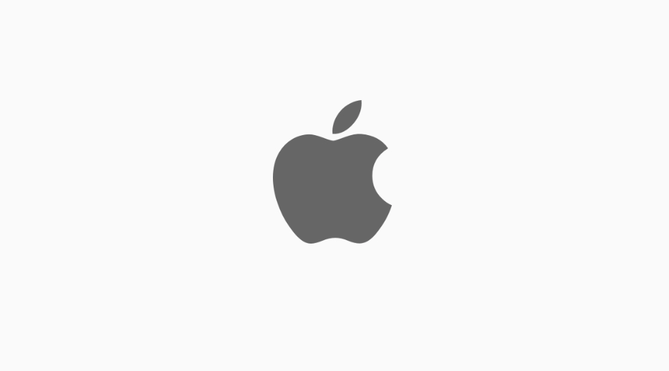
In 1981, Steve Jobs was asked by a journalist why he chose the name Apple. Jobs answered the question simply by saying that he wanted to create a logo that is simple, powerful, and sophisticated — that’s it.
Apple’s logo inspiration has a lot of theories online. From Alan Turing’s story about eating a cyanide-laced apple to commit suicide, to Adam and Eve’s story where the bitten apple symbolizes both the fall of man and immense knowledge. It also depicts apples as “The fruit of creation.”
The designer of the logo, Rob Janoff, said in an interview with Forbes that he created the logo for one main reason. And that was to get people to notice that owning an Apple computer isn’t just about buying a hard-edged metal that looks intimidating and unwelcoming. He also chose to place a bite mark on the apple so that it won’t be misinterpreted as something else.
Janoff wanted to create a logo that symbolizes knowledge, power, and enlightenment for mankind—a bitten apple represents exactly that.
g.) Unilever
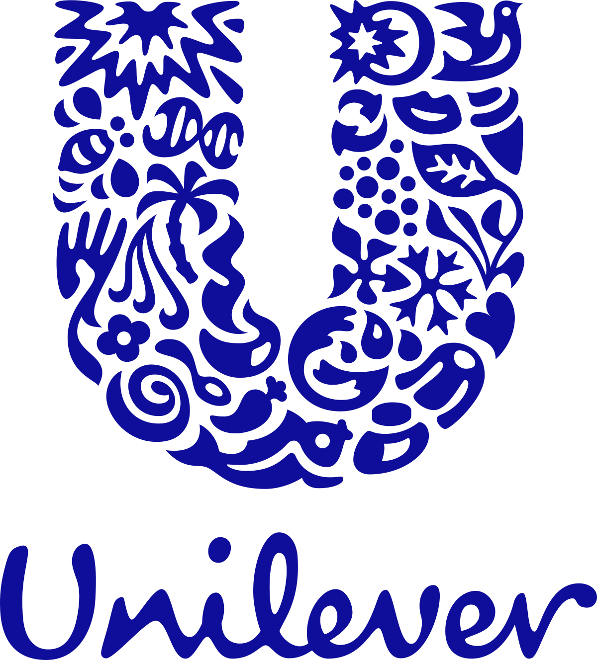
One of the most prime logo design inspirations is Unilever’s logo. The designers took creativity to the next level by making their designs a bit more personal and transparent. They included 24 icons that each represent something important to their company. Let’s take a quick look at their meaning:
- Ice Cream – fun and amusement
- Hand – a character that means care, need, and sensitivity
- Hair – confidence through beauty or looking good
- Lips – openness and transparency
- Swirl – zealous about great taste and flavors.
- Fish – fresh resources and the sea.
- Clothes – promotes looking good and feeling confident.
- Bee – speaks for their enthusiasm to find innovative ways to reduce environmental footprints
- Particles – refers to their commitment to improving their consumers’ lives
- Packaging – constantly looking for better ways to package their products that are eco-friendly and convenient for the consumers
- Transformation – positive change and transformation for the business
- Waves – cleanliness and vigor
- DNA – the genetic blueprint of human existence
- Palm Tree – the company’s utmost respect for the natural world
- Heart – health, care, and love
- Virtuous Cycle – their continuous work to lessen the waste connected to the disposal of their products
- Sun – their dedication to finding innovative ways to reduce the greenhouse gas impact of their products across the life cycles
- Dove – empowerment, freedom, and self-esteem
- Plant – their efforts to reduce environmental impact across all of their value chain
- Spark – the company’s role as a catalyst for change as they continue to enhance the lives of the people they work with around the world
- Chilli Pepper – fresh agricultural materials for production
- Spoon – their commitment to constantly enhance the nutritional quality and taste of their produce
- Bowl – amazing and healthy ingredients they use
- Flower – care and sensitivity for their consumers and nature
h.) Marlboro

Marlboro’s logo design represents the symbol of rugged individualism and masculinity that performed well for years. The font used is readable, professional, and blends well with the company’s theme. The colors in addition relay the qualities the company has — red (passion, excitement, playfulness), white (purity, cleanliness, innocence), black (seriousness, professionalism).
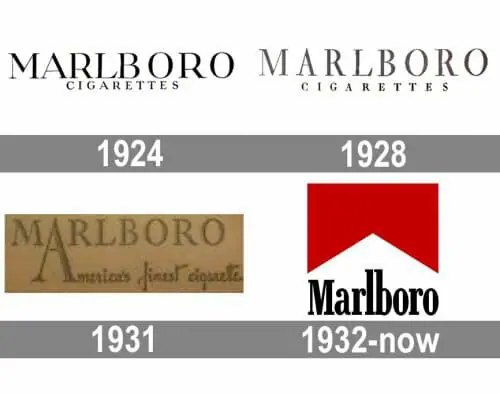
The design itself was amended a few times, but Marlboro’s minimalist design is still favored up to this day because of its timeless outline and confident outlook.
Logo Design Inspirations for Young Branding (Startups)
a.) DotYeti.com
It’s not common to see a Yeti as a brand face and that’s exactly what made DotYeti stand out with their logo. Even though yetis are supposed to be hair-raising mythological creatures, DotYeti was able to recreate this amazing creature into a warm and friendly being.
The idea came from the co-founder of the company, Roy Selbach, who is a big fan of League of Legends. One of the playable characters in the game is also a Yeti (see image below):
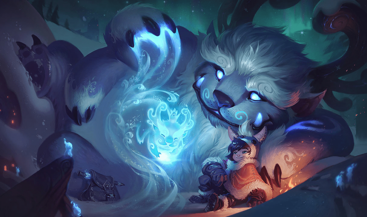
The original plan was to choose which of the three characters is more engaging: a kiwi, a panda, and a yeti. Since pandas are very common and a kiwi doesn’t seem to speak for the brand, the designer decided to use the yeti instead. The color palette is a tie-in with EOI Digital, the mother company that conceived DotYeti.
The designer recreated a yeti that was not just cute and enchanting, but it represents the company really well — fun, versatile, and friendly.
Despite being fairly new, the graphic design platform has over 100+ known brands that trust their services. DotYeti specializes in bringing their clients the best unlimited graphic design services for a price that is affordable for everyone.
b.) StethoMe®

The smiling stethoscope has an inviting appearance that can warm the heart of almost anyone. Their friendly approach helps project the company’s personality just by looking at their logo. The cartoon design is unique, professional, and it builds trust.
StethoMe® allows you to examine yourself through medical AI algorithms (CE2274) by working together with a wireless stethoscope without leaving your house.
c.) GROOVL1N (그루블린)
Groovl1n’s original logo design was created by Kim Won-Sik A.K.A Ravi (founder) is alluring and professional despite its simplicity. The ‘G’ in the middle represents the name of the label and the surrounding shapes are said to be goblin horns. This logo has established its online reputation with its creative and adaptable design.

Image from KS
Ravi from the famous South Korean boy band “VIXX” established his own hip-hop label called GROOVL1N last year. The name came from combining the words “Groove” and “Goblin” which means “wonderful people in the East.”
d.) My Indian Closet
Janis Ancitis created this brilliant logo for a company that sells high-end designer clothes from India called “My Indian Closet.” Ancitis wanted to incorporate something that strongly represents India and fashion. Ancitis shaped the hangers to look like the Taj Mahal which clearly represents both elements.
e.) Fable Skateboards
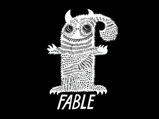
Founded in 2017, Fable Skateboards logo was influenced by Nordic fables that resulted in an appealing and creative design.
Skateboard culture has a huge influence on today’s fashion, music, and lingo. Its outstanding graphic designs and punk rock spirit has been around since the 1990s. Fable Skateboards made sure to incorporate that culture into their logo design. As well as their overall aesthetics to build trust and a strong bond with their customers.
They also donate 50% of their profit to charitable causes and organizations that focus on donating skate equipment and organizations that cater as a temporary shelter for asylum seekers.
Logo Design Inspirations for Tech Companies
a.) PlayStation
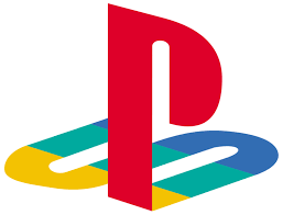
The letter P on top of the letter S is a complex design that Japanese artist Manabu Sakamoto created. The bright colors red, yellow, and blue are used to represent joy, honesty, trust, and passion. Also, the logo always appears before a game starts. This makes it memorable and easily instilled in the mind of the players.
Sakamoto also designed unique logos for Sony that are original, timeless, and distinctive that unites the history of the company and it’s logo design.

Abstract and surrealism illustrations are one of the most used graphic design styles in 2020. The out-of-the-box concept is a visual language represented through uneven lines, shapes, and colors. Creative geometrical forms can spark the imagination of the viewer and it’s a well-fitted design for the rising tech generation.
b.) Vaio
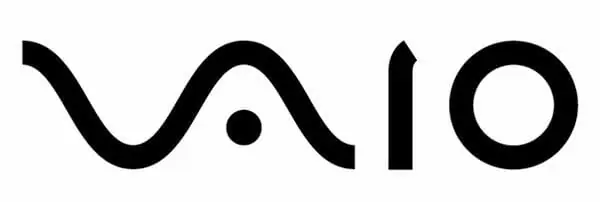
If you’re looking for a customer-driven logo design inspiration, take a look at Vaio’s logo. Teiyu Goto, the designer of the Vaio logo, understood their audience. Their target market is creative professionals—primarily the youth. Goto designed the Vaio logo to be visually appealing to their market. All while still incorporating a deeper meaning in their symbols.
The design of the logo is divided into two parts. First, the “VA” is a symbol for an analog wave. Second, “IO” represents a digital binary code.
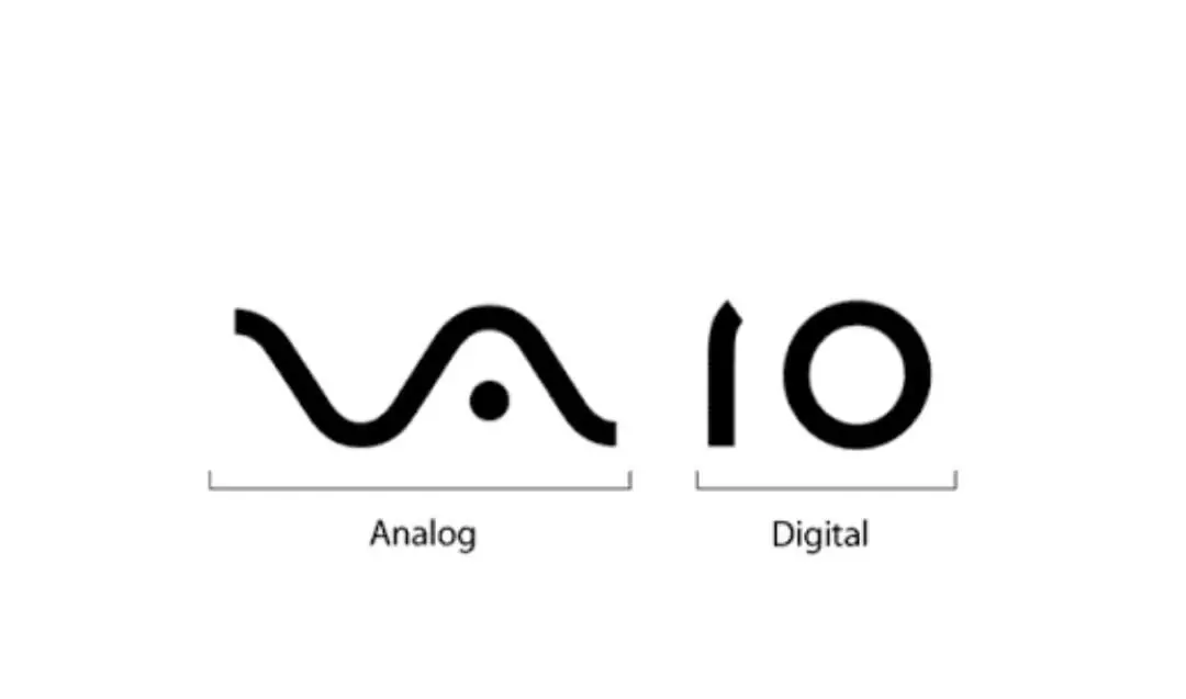
Analog Wavelength

Binary Code

The motion from the analog wavelength (left) to the binary code (right) represents the progress of Vaio’s constant innovation in their technology. Goto wanted to show the evolution of their products and how the company has been continuously improving its technology over time.
c.) IBM
Minimalist fonts are effortless and straightforward. Add a few more elements and you are bound to stand out!
International Business Machines Corporation or IBM’s iconic logo was created by Paul Rand. His work for IBM is still well known up to this day. Rand completely understood the importance of individuality in order to stand out from the competition. The bars represent a better sense of unity in the monogram and suggest a sense of movement. Their logo is widely recognized in over 170 countries around the world.
d.) Beats by Dre
Have you ever noticed that the letter ‘b’ in the logo means more than just “beats”? The ‘b’ actually represents their headphone and the circle around it is a human’s head. Logo designs can be creative like that. It may look simple at the first glance but it actually has a hidden meaning to it.
The logo gives you a glance of the quality and identity of the product. The design itself is fresh and stylish. That’s why it still hasn’t been changed ever since its establishment in 2006.
e.) Verizon Visible
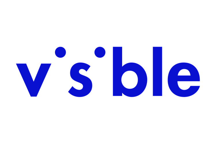
Millennials and Gen Z often communicate through emoticons and pictures. Visible’s graphic designer incorporated that in their logo to make their brand more engaging to the younger generation.
The “i”s at the center only left out two dots to make a face. This way, it can show different kinds of expressions like sadness, happiness, excitement, and other playful figures. The color scheme also indicates that the brand is dependable, trustworthy and confident.
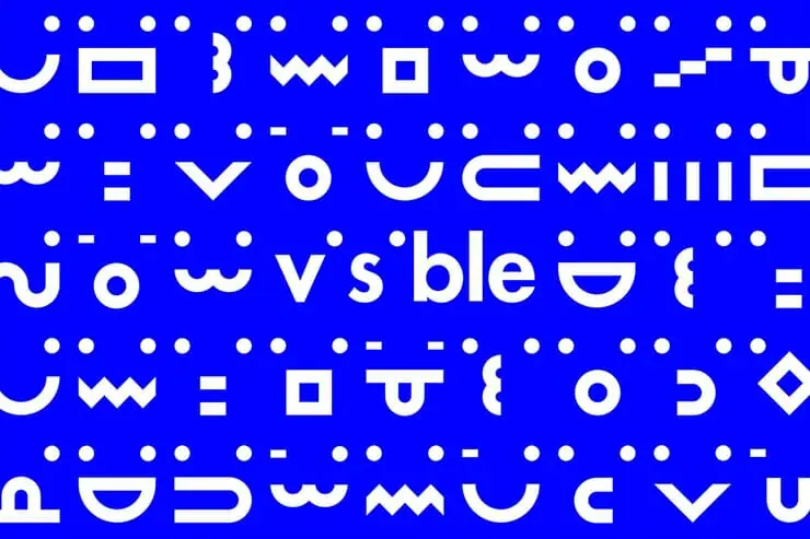
Visible, a digital wireless carrier by Verizon, understood the importance of innovation and timelessness. The design of their logo has an expressive and approachable aura to it that can easily be loved by anyone.
Visible is a wireless provider that is designed to make phone services simple and affordable through its app.
f.) Killed Productions
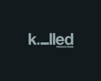
This logo by Sean Heisler gave life to the name of the brand by purposely typing in the letter “i” horizontally. The purpose was to make it seem like it was killed. It may not seem like much because of its directness, but it’s enough to speak loudly for the brand.
Logo Design Inspirations for Food Brands
a.) Toblerone
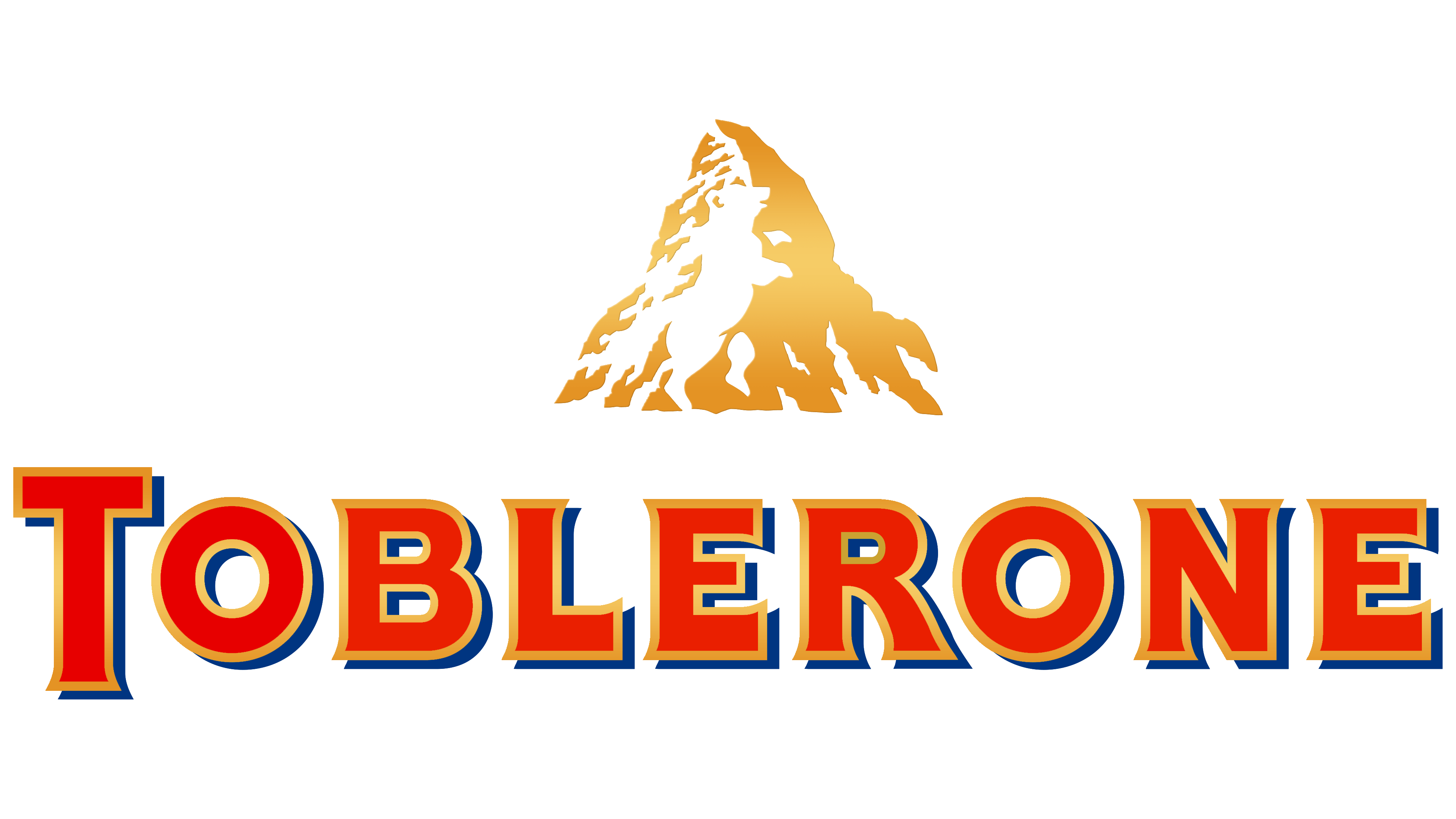
You can also use the birthplace of your business as an inspiration for your logo design. Toblerone’s logo highlights the location of where the company began and has never changed it since 1999. There are two important elements in this logo: first is the mountain, second is the bear in the middle.
The mountain is said to be Matterhorn in the Swiss Alps. The bear tells the story of Bern, the city where this exemplary chocolate was born.
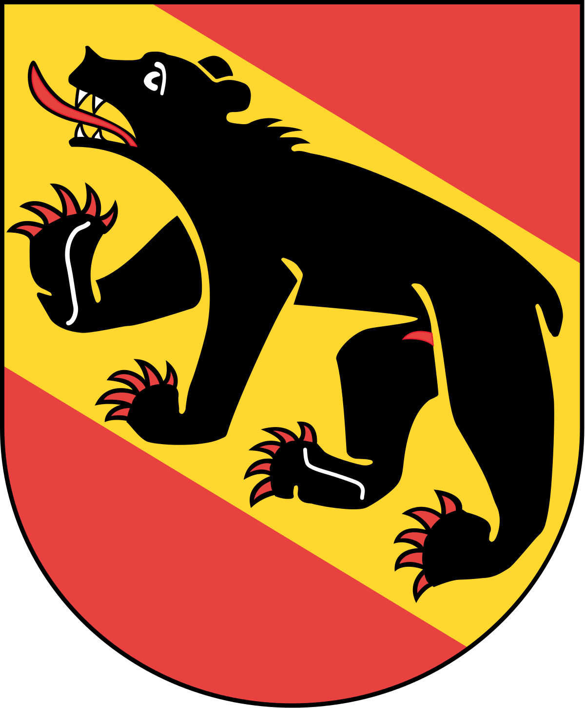
Bern is popularly known as “The City of Bears” because of Duke Berthold V of Zähringen’s vow to name the city the first animal he hunts. According to the Tschachtlanchronik (oldest Swiss illustrated chronicles), the first bear he was able to capture is a black bear; hence the black bear on the flag. Businesses in Bern also feature a bear symbol to give honor to their beloved city.
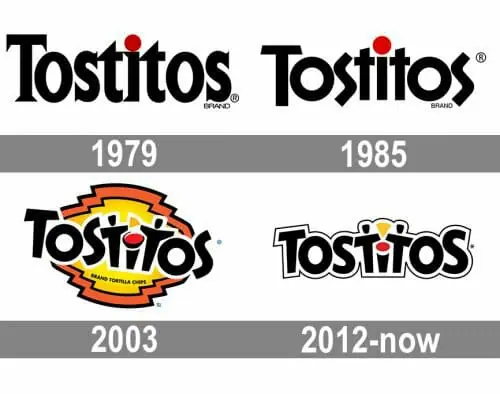
b.) Tostitos
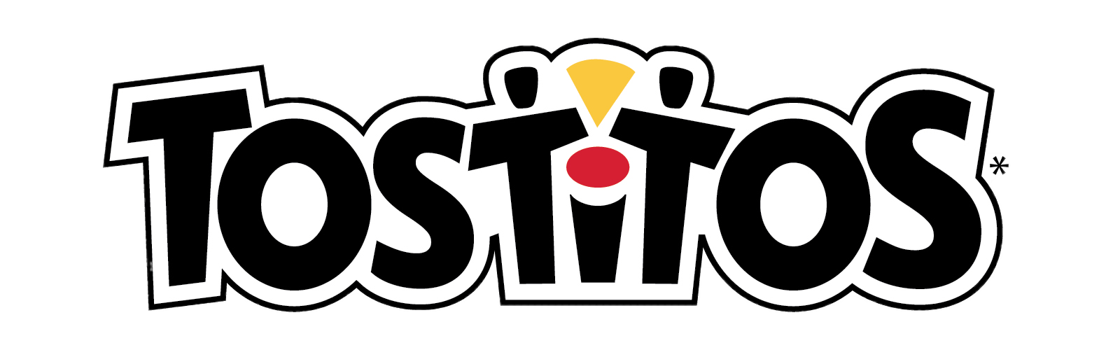
Famous for their tortilla chips and salsa, Tostitos proudly shows that in their logo. The red dot on the letter “i” acts as a bowl of salsa and the “t”s on both sides represents two people holding their delicious chips.
The concept of the logo didn’t change much throughout the years. In fact, the designers of Tostitos’ logo wanted to show everyone a particular message. Which was that sharing a tasty bowl of salsa and a bag of Tostitos chips can help you connect with anyone.
c.) Baskin Robbins
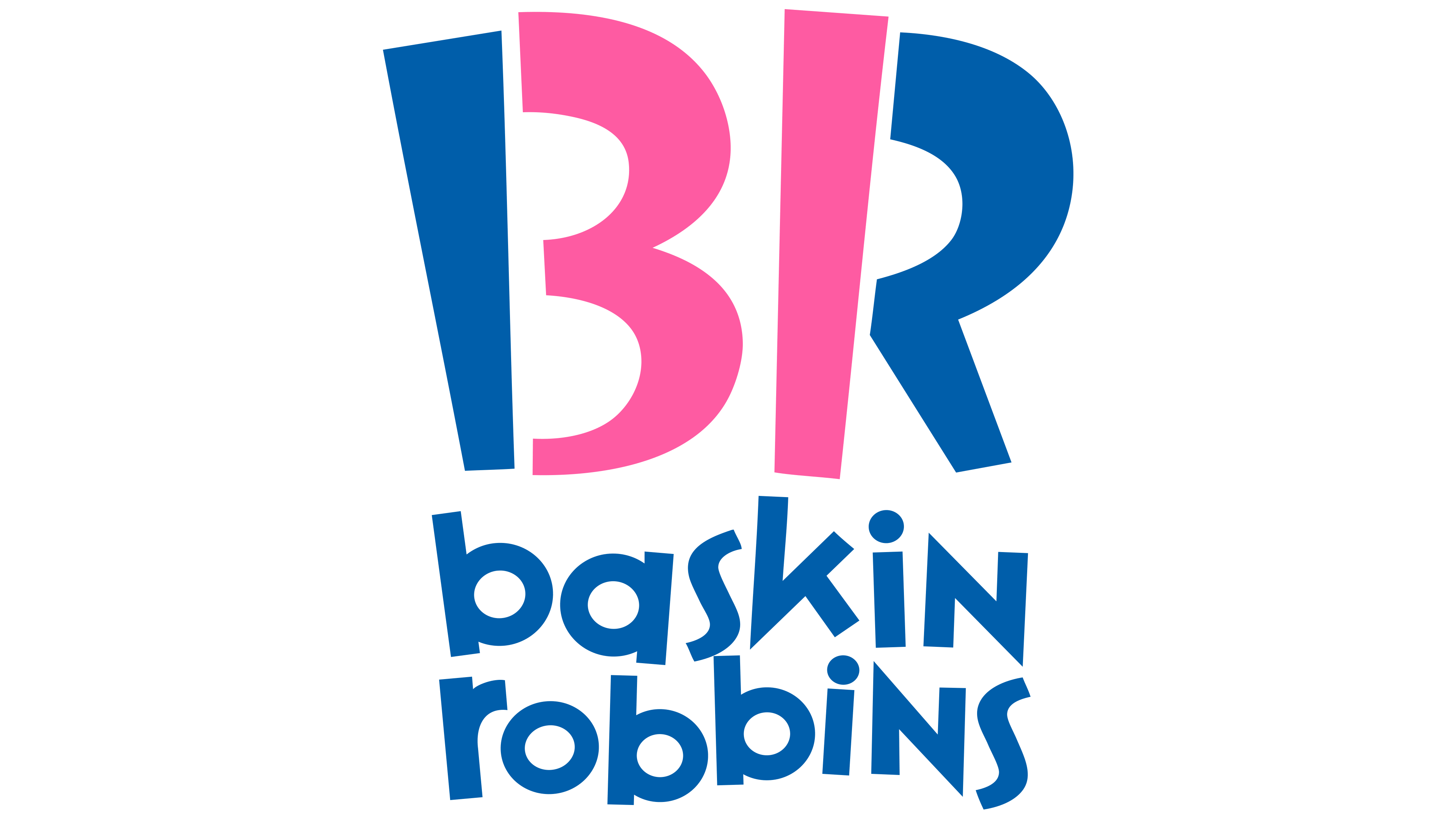
The number “31” has always been a special number for the company and it’s perfectly hidden in their current logo. Some won’t even notice it right away. But if you’ve been a long-time Baskin Robbins fan, you would notice the sacred number right away.
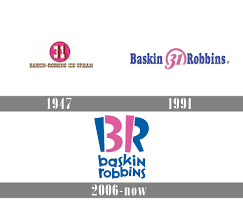
31 stands for their 31 different flavors that got consumers really excited when it was first launched in the 1950s. The goal was for their consumers to try a new flavor each month. As a result, they were able to establish their brand.
Even though decades have passed, they decided to keep the number 31 in their logo as a part of their brand identity. As well as to remind the world that it all started with 31 flavors to build their empire.
Creative Logo Designs with DotYeti
Logo design inspirations can be found in various places! Which of these companies inspired you to get creative with your logo? If you have a rough idea for your logo, send us a message and we’ll help you execute your design.
We have different price packages that you can choose from to avail of our unlimited graphic design services. Feel free to visit our DotYeti Portfolio to see some of our work!

![[UPDATED] The 2024 Complete Graphic Design for Marketing Guide](https://www.dotyeti.com/wp-content/uploads/2021/12/2022.jpg)