You may have heard – Reddit got a rebrand! Let’s dive into the whirlpool of the latest branding buzz – the Reddit rebrand. It’s not just a facelift; it’s a masterclass in evolving a brand while keeping its soul intact. So buckle up, as we uncover the strategy, design, and the oh-so-important takeaways for you and your brand!
What happened
Reddit, a prominent online community platform established in 2005, is known for its ‘subreddits’ which are popular for product reviews and cultural discussions. Recently, Reddit faced community backlash due to changes in its API policy affecting third-party apps, leading to some subreddits temporarily shutting down.
To revamp its image, Reddit collaborated with Pentagram, a renowned branding studio. Pentagram’s partner, Natasha Jen, mentioned in a Fast Company interview that the rebrand aimed to streamline Reddit’s brand identity, catering to its expanding user base and feature set.
The strategy behind the Reddit rebrand
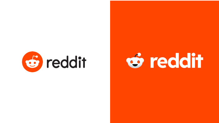
Image from Reddit
The Reddit rebrand isn’t just about slapping on a fresh coat of paint. It’s a strategic move, born out of necessity and foresight. Reddit, our beloved digital agora, has grown exponentially since its inception in 2005. With millions flocking to its plethora of subreddits, it was time for Reddit to evolve, to resonate with its burgeoning, diverse audience while stepping boldly into new markets.
The Reddit logo: More than just a makeover
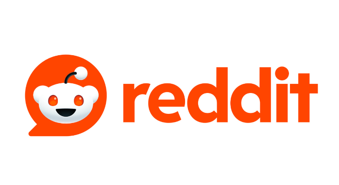
Image from Reddit
When we say ‘Reddit logo,’ what pops in your mind? That adorable little alien, right? Meet Snoo, the heart of the Reddit logo design, who’s undergone a cosmic transformation. Now in 3D, with a body and opposable thumbs (yes, thumbs!), Snoo is all set to interact in a more human-like way. This shift reflects Reddit’s commitment to fostering a more engaging, inclusive community.
Font design: Reading between the letters
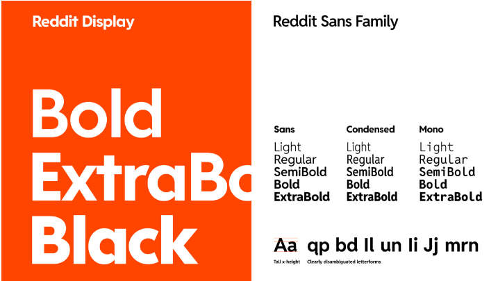
Image from Reddit
Logo design is not just art; it’s communication. The new Reddit font, dubbed ‘Reddit Display,’ is a testament to this. It’s sleek, modern, and carries a hidden gem – a speech bubble in the lowercase ‘d.’ This subtle nod to communication and dialogue underscores what Reddit stands for: a place for conversation, for voices to be heard.
The rebrand: A kaleidoscope of colors
Image from Reddit
Move over, traditional red, white, and black. The Reddit rebrand introduces a playful palette with GuavaPink, LimeGreen, BananaYellow, and JuniperBlue. This color expansion is more than aesthetic; it symbolizes Reddit’s dynamic, vibrant community – a tapestry of thoughts, stories, and perspectives.
Actionable takeaways for SMBs and startups
- Embrace Evolution: Just like Reddit, don’t be afraid to evolve. Your brand isn’t static; it’s a living entity that should grow with your audience.
- Subtle Yet Significant: In logo design, sometimes the smallest change makes the biggest impact. The Reddit logo teaches us the power of subtlety and symbolism.
- Color Your World: Colors evoke emotions. Choose a palette that reflects your brand’s spirit and resonates with your audience.
- Community is Key: Remember, at the heart of every brand is its community. Engage, listen, and evolve with them.
DotYeti: Your branding partner
Now, let’s talk about bringing these insights into your world. DotYeti, a leader in graphic design, breathes life into brands. Whether it’s a rebrand, a new logo, or a complete visual overhaul, their team of creative wizards works magic. With quick turnarounds, unlimited revisions, and a buffet of design services, they’re the go-to for small businesses and startups looking to make a splash in their industry.
So, there you have it – a peek into the Reddit rebrand and some golden nuggets for your entrepreneurial journey. Remember, your brand is a story unfolding. Keep it fun, keep it real, and when in doubt, give it a little Yeti touch! 🚀👾🎨